Are you looking to create a smooth and intuitive user experience for your Android app? Implementing a navigation drawer could be the solution you need! In this tutorial, we'll walk you through the process of integrating a navigation drawer into your app using Kotlin in Android Studio.
Click here to Watch Video on Youtube
Step 1: Set up your project
To get started, open Android Studio and create a new project. Make sure you choose Kotlin as your programming language.
Step 2: Adding dependency to the project.
Add the CircleImageView library to an Android project, which provides a custom ImageView implementation that displays images in a circular shape.
build.gradle (Module: app)
dependencies {

    implementation 'androidx.core:core-ktx:1.8.0'
    implementation 'androidx.appcompat:appcompat:1.6.1'
    implementation 'com.google.android.material:material:1.5.0'
    implementation 'androidx.constraintlayout:constraintlayout:2.1.4'
    testImplementation 'junit:junit:4.13.2'
    androidTestImplementation 'androidx.test.ext:junit:1.1.5'
    androidTestImplementation 'androidx.test.espresso:espresso-core:3.5.1'
    implementation 'de.hdodenhof:circleimageview:3.1.0'

}
themes.xml
<resources xmlns:tools="http://schemas.android.com/tools">
    <!-- Base application theme. -->
    <style name="Base.Theme.MyApplication" parent="Theme.AppCompat.DayNight.NoActionBar">

        <item name="android:windowTranslucentStatus">true</item>
        <item name="android:windowLightStatusBar">true</item>
        <item name="android:windowDrawsSystemBarBackgrounds">false</item>


        <!-- Customize your light theme here. -->
        <!-- <item name="colorPrimary">@color/my_light_primary</item> -->
    </style>

    <style name="Theme.MyApplication" parent="Base.Theme.MyApplication" />
</resources>
strings.xml
<resources>
    <string name="app_name">My Application</string>
        <string name="navigation_drawer_open">Open navigation drawer</string>
        <string name="navigation_drawer_close">Close navigation drawer</string>

</resources>
colors.xml
<?xml version="1.0" encoding="utf-8"?>
<resources>
    <color name="black">#FF000000</color>
    <color name="white">#FFFFFFFF</color>
    <color name="purple">#647CFD</color>
</resources>

Step 7: Create your menu items
Next, we need to create the menu items that will be displayed in the NavigationView. Open the res folder in your project, right-click on it, and select New -> Android Resource File. Choose "Menu" as the Resource type and name it "nav_menu". In the nav_menu.xml file, add the following code:
nav_menu.xml
<menu xmlns:android="http://schemas.android.com/apk/res/android"
    xmlns:tools="http://schemas.android.com/tools"
    tools:showIn="navigation_view">

    <group android:checkableBehavior="single">
        <item
            android:id="@+id/nav_home"
            android:title="Home"
            android:icon="@drawable/baseline_home_24"
            android:padding="10dp" />

        <item
            android:id="@+id/nav_profile"
            android:title="Profile"
            android:icon="@drawable/baseline_account_circle_24"
            android:padding="10dp" />

        <item
            android:id="@+id/nav_settings"
            android:title="Settings"
            android:icon="@drawable/baseline_settings_24"
            android:padding="10dp" />

        <item
            android:id="@+id/nav_notifications"
            android:title="Notifications"
            android:icon="@drawable/baseline_notifications_24"
            android:padding="30dp" />

        <item
            android:id="@+id/nav_help"
            android:title="Help"
            android:icon="@drawable/baseline_help_24"
            android:padding="10dp" />
    </group>


    <item android:title="Profile">

        <menu>

            <group android:checkableBehavior="single">


            <item
        android:id="@+id/nav_logout"
        android:title="Logout"
        android:icon="@drawable/baseline_logout_24"
        android:padding="10dp" />


            </group>

        </menu>

    </item>


    <item android:title="Comunicate">

        <menu>

            <group android:checkableBehavior="single">

            <item
                android:id="@+id/nav_contactus"
                android:title="Contact us"
                android:icon="@drawable/baseline_chat_24"

                android:padding="10dp" />

            <item
                android:id="@+id/nav_rate"
                android:title="Rate us"
                android:icon="@drawable/baseline_star_rate_24"

                android:padding="10dp" />

            <item
                android:id="@+id/nav_about"
                android:title="About us"
                android:icon="@drawable/baseline_help_24"

                android:padding="10dp" />


            </group>

        </menu>

    </item>


</menu>
nav_header.xml
<LinearLayout
    xmlns:android="http://schemas.android.com/apk/res/android"
    xmlns:app="http://schemas.android.com/apk/res-auto"
    android:layout_width="match_parent"
    android:layout_height="wrap_content"
    android:orientation="vertical"
    android:paddingBottom="25dp"
    android:paddingStart="20dp"
    android:background="@color/purple">

    <de.hdodenhof.circleimageview.CircleImageView
        android:id="@+id/circle_image_view"
        android:layout_width="80dp"
        android:layout_height="80dp"
        android:src="@drawable/ic_launcher_foreground"
        app:civ_border_color="#FFFFFFFF"
        app:civ_border_width="2dp"
        android:layout_marginTop="60dp"
        app:civ_circle_background_color="#4B60DD"/>


    <TextView
        android:layout_width="wrap_content"
        android:layout_height="wrap_content"
        android:text="John Doe"
        android:textColor="@color/white"
        android:textSize="20sp"
        android:layout_marginTop="10dp"
        android:textStyle="bold" />

    <TextView
        android:layout_width="wrap_content"
        android:layout_height="wrap_content"
        android:layout_marginTop="3dp"
        android:textColor="@color/white"
        android:textSize="15sp"
        android:text="johndoe@example.com" />

</LinearLayout>
activity_main.xml
<?xml version="1.0" encoding="utf-8"?>
<androidx.drawerlayout.widget.DrawerLayout xmlns:android="http://schemas.android.com/apk/res/android"
    xmlns:app="http://schemas.android.com/apk/res-auto"
    xmlns:tools="http://schemas.android.com/tools"
    android:layout_width="match_parent"
    android:layout_height="match_parent"
    android:id="@+id/drawer_layout"
    android:fitsSystemWindows="false"
    tools:context=".MainActivity">

    <!--     android:fitsSystemWindows="false"     -->

    <TextView
        android:layout_width="wrap_content"
        android:layout_height="wrap_content"
        android:text="Hello World!"
        app:layout_constraintBottom_toBottomOf="parent"
        app:layout_constraintEnd_toEndOf="parent"
        app:layout_constraintStart_toStartOf="parent"
        app:layout_constraintTop_toTopOf="parent" />


    <androidx.coordinatorlayout.widget.CoordinatorLayout
        android:layout_width="match_parent"
        android:layout_height="match_parent">

        <com.google.android.material.appbar.AppBarLayout
            android:layout_width="match_parent"
            android:gravity="bottom"
            android:background="@color/white"
            android:layout_height="85dp">

            <androidx.appcompat.widget.Toolbar
                android:id="@+id/toolbar"
                android:layout_width="match_parent"
                android:layout_height="?attr/actionBarSize"
                android:layout_gravity="bottom"
                android:background="@color/white"
                app:layout_scrollFlags="scroll|enterAlways"
                />

        </com.google.android.material.appbar.AppBarLayout>

        <!-- Add your app's content here -->


        <TextView
            android:text="TechWorld"
            android:textSize="50dp"
            android:layout_marginTop="300dp"
            android:textColor="@color/black"
            android:textAlignment="center"
            android:layout_width="match_parent"
            android:layout_height="wrap_content">
        </TextView>


    </androidx.coordinatorlayout.widget.CoordinatorLayout>


    <com.google.android.material.navigation.NavigationView
        android:id="@+id/nav_view"
        android:layout_width="wrap_content"
        android:layout_height="match_parent"
        android:layout_gravity="start"
        app:headerLayout="@layout/nav_header"
        android:fitsSystemWindows="true"
        android:background="@color/white"
        app:itemTextColor="@color/black"
        app:menu="@menu/nav_menu" />


</androidx.drawerlayout.widget.DrawerLayout>
MainActivity.kt
import android.content.res.Configuration
import android.os.Bundle
import android.view.MenuItem
import android.widget.Toast
import androidx.appcompat.app.ActionBarDrawerToggle
import androidx.appcompat.app.AppCompatActivity
import androidx.core.view.GravityCompat
import androidx.drawerlayout.widget.DrawerLayout
import com.google.android.material.navigation.NavigationView

class MainActivity : AppCompatActivity() {

    private lateinit var drawerLayout: DrawerLayout
    private lateinit var navigationView: NavigationView
    private lateinit var toggle: ActionBarDrawerToggle


    override fun onCreate(savedInstanceState: Bundle?) {
        super.onCreate(savedInstanceState)
        setContentView(R.layout.activity_main)


        drawerLayout = findViewById(R.id.drawer_layout)


        setSupportActionBar(findViewById(R.id.toolbar))
        supportActionBar?.setDisplayHomeAsUpEnabled(true)

        navigationView = findViewById(R.id.nav_view)

        toggle = ActionBarDrawerToggle(
            this,
            drawerLayout,
            findViewById(R.id.toolbar),
            R.string.navigation_drawer_open,
            R.string.navigation_drawer_close
        )
        drawerLayout.addDrawerListener(toggle)


        val navigationView = findViewById<NavigationView>(R.id.nav_view)
        navigationView.setNavigationItemSelectedListener { menuItem ->
            // Handle menu item clicks here
            when (menuItem.itemId) {
                R.id.nav_home -> {
                    // Handle home item click
                    Toast.makeText(applicationContext, "Home clicked", Toast.LENGTH_SHORT).show()
                    drawerLayout.closeDrawer(GravityCompat.START)
                    return@setNavigationItemSelectedListener true

                    true
                }
                R.id.nav_profile -> {
                    // Handle profile item click
                    Toast.makeText(applicationContext, "Profile clicked", Toast.LENGTH_SHORT).show()
                    drawerLayout.closeDrawer(GravityCompat.START)
                    true
                }
                R.id.nav_settings -> {
                    // Handle settings item click
                    Toast.makeText(applicationContext, "Settings clicked", Toast.LENGTH_SHORT).show()
                    drawerLayout.closeDrawer(GravityCompat.START)
                    drawerLayout.closeDrawers()
                    true
                }
                R.id.nav_notifications -> {
                    // Handle notifications item click
                    Toast.makeText(applicationContext, "Notifications clicked", Toast.LENGTH_SHORT).show()
                    drawerLayout.closeDrawer(GravityCompat.START)
                    true
                }
                R.id.nav_help -> {
                    // Handle help item click
                    Toast.makeText(applicationContext, "Help clicked", Toast.LENGTH_SHORT).show()
                    drawerLayout.closeDrawer(GravityCompat.START)
                    true
                }
                R.id.nav_logout -> {
                    // Handle logout item click
                    Toast.makeText(applicationContext, "Logout clicked", Toast.LENGTH_SHORT).show()
                    drawerLayout.closeDrawer(GravityCompat.START)
                    true
                }
                R.id.nav_contactus -> {
                    // Handle contact us item click
                    Toast.makeText(applicationContext, "Contact us clicked", Toast.LENGTH_SHORT).show()
                    drawerLayout.closeDrawer(GravityCompat.START)
                    true
                }
                R.id.nav_rate -> {
                    // Handle rate item click
                    Toast.makeText(applicationContext, "Rate clicked", Toast.LENGTH_SHORT).show()
                    drawerLayout.closeDrawer(GravityCompat.START)
                    true
                }
                R.id.nav_about -> {
                    // Handle about item click
                    Toast.makeText(applicationContext, "About clicked", Toast.LENGTH_SHORT).show()
                    drawerLayout.closeDrawer(GravityCompat.START)
                    true
                }
                else -> false
            }
            true
        }

    }

    override fun onPostCreate(savedInstanceState: Bundle?) {
        super.onPostCreate(savedInstanceState)
        toggle.syncState()
    }

    override fun onConfigurationChanged(newConfig: Configuration) {
        super.onConfigurationChanged(newConfig)
        toggle.onConfigurationChanged(newConfig)
    }

    override fun onOptionsItemSelected(item: MenuItem): Boolean {
        return when (item.itemId) {
            android.R.id.home -> {
                drawerLayout.openDrawer(GravityCompat.START)
                true
            }
            else -> super.onOptionsItemSelected(item)
        }
    }
}
This code adds an ImageButton to the toolbar with the icon of three horizontal lines (often referred to as a "hamburger" icon) and a click listener that opens the navigation drawer.
Step 11: Test your app
That's it! You've successfully added a navigation drawer to your Android app using Kotlin in Android Studio. Now it's time to test your app to make sure everything is working as expected.
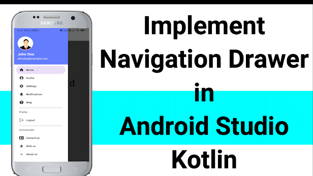
Final Result:

Conclusion
In this tutorial, we've covered the basics of implementing a navigation drawer in Android Studio using Kotlin. By following these steps, you can create a more user-friendly and efficient app navigation system. With some customization, you can make your navigation drawer fit the unique needs of your app. Good luck!